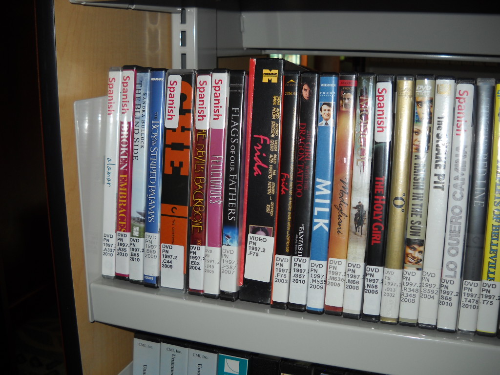
 This afternoon I placed "Spanish" labels to all Spanish films for easier browsing. Please let the circulation desk know if I missed one. All French and Chinese films will have similiar labels by next week.
Wednesday, May 18, 2011
Spanish Films Tagged in Collection
This afternoon I placed "Spanish" labels to all Spanish films for easier browsing. Please let the circulation desk know if I missed one. All French and Chinese films will have similiar labels by next week.Friday, May 6, 2011
Picture of the Day

Circulation Coordinator Donnie Quist signs graduating senior Tiffany Cade's final timesheet. Tiffany was a library work study for her entire four years at Coker College. She and Jayla Parks (another long-time library work study) will be missed!
Food for Fines
 Got Fines? We can help with that! Bring a non-perishable food item and earn $5 in credit toward library fines (per item).
Photo courtesy of Brian Green's Blog: http://www.brianjgreen.net
Tuesday, May 3, 2011
Writer's Studio Hours for Exams
The Writer's Studio will be wrapping up the semester on Monday, May 9th.
Here are its hours for the end of the semester:
Wednesday, May 4: 4:00 PM- 10:00 PM
Thursday, May 5: 4:00 PM - 10:00 PM
Friday, May 6: 4:00 PM - 10:00 PM
Sat. & Sun. May7/8: Closed
Monday, May 9: 4:00 PM - 10:00 PM
Here are its hours for the end of the semester:
Wednesday, May 4: 4:00 PM- 10:00 PM
Thursday, May 5: 4:00 PM - 10:00 PM
Friday, May 6: 4:00 PM - 10:00 PM
Sat. & Sun. May7/8: Closed
Monday, May 9: 4:00 PM - 10:00 PM
Monday, May 2, 2011
Extended Hours Begin Wednesday!
 It's that time of the semester again...
We'll have extended hours, beginning Wednesday, May 4.
FINAL EXAMS | |
| Wednesday, May 4 | 7:45 a.m. - 12:00 a.m. |
| Thursday, May 5 | 7:45 a.m. - 12:00 a.m. |
| Friday, May 6 | 7:45 a.m. - 8:00 p.m. |
| Saturday, May 7 | 8:00 a.m. to 8:00 p.m. |
| Sunday, May 8 | 12:00 p.m. - 12:00 a.m. |
| Monday, May 9 | 7:45 a.m. - 12:00 a.m. |
| Tuesday, May 10 | 7:45 a.m. - 11:00 p.m. |
Do you need an exam schedule? Click Here.
Tuesday, April 26, 2011
Taming the Wild Wild Web: Bing Health Maps
We get a lot of questions about statistics and although we do have resources that we pay for (such as Historical Statistics of the United States and Statistical Warehouse), sometimes our patrons want to a slightly different experience.
Bing Maps, Microsoft's map platform, offers a series of different map apps or overlays that enhances the content of the maps. At this writing, there are 59 different apps covering a variety of topics, such as restaurant suggestions, Japanese earthquake information, roadside attractions, and so forth. Bing Health Maps offers Health and Human Services data by county, with many popular statistics as obesity, infant mortality, and smoking rates.
Here's how you use it:
Go to http://bing.com/maps
Look for the itty bitty map apps button down in the lower left hand column:
 You'll then get a pop-up box with the map apps listed. Bing Health Maps should be among the first you see:
 Note the update date. The stats here are a little less than a year old, at least. Hopefully, the Bing Apps team will strive to update these numbers as they become available.
The map app takes a minute to load, and it should load (if geolocation is enabled in your browser), to your home state. Interestingly enough, it loads North Carolina if you are on Coker's campus, because the campus Internet service provider is based in the Rock Hill/Charlotte area.
You can pick which state, and the select which community health indicator you want to examine. The map is broken down by county, which is one unique feature that Bing Maps has over the more popular Google Maps.
Clicking on the county brings up a popup with all of the community health indicators listed, in three separate categories. As it stands now, there isn't an easy way to print the information or even compare counties (or states). But it does give you some important information easily, and it invites serendipitous knowledge discovery.
What other Bing Map Apps do you find interesting? Post in the comments below.
Monday, April 25, 2011
Subscribe to:
Posts (Atom)